top of page


PayPulse


Project Info
This payment app is associated with a Namibian Bank. It aims to expedite electronic payments within the country.
Since the app did not engage much of its populace, we were approached by the clients to redesign the entire interface of the application by closely maintaining its brand identity.
Role
Product Designer
Team of 3
Website Links


Tasks Executed...
1. Finance transaction utility analysis of Namibian locals.
Data analysis of the existing application.
+
Information deducted through 12 user interviews.
+
Client and stakeholder's
response over existing utility.
2. Finding gaps in design structures and hierarchies.
3. Comparison analysis of effective applications.
4. Pretotyping to validate additional feature responses.
5. Integrating relevant design stimulation with functional specifications.
6. Targeting contextual requirements in compliance with brand identity through UI.
Design Theme Selections


Existing Interface
Revised Interface


-
Payment options are categorized into four buttons for selective navigation, plus to avoid scattered out confusing options on the home screen.
-
Any deals/ promotions/ adverts/ services, flash in the center for direct communication.
-
Frequent payment options are accentuated on top of the screen to grab the attention of the user.
-
Maintaining Brand identity in subtler tones.
Home


-
Provision to add or select different payment methods.
-
Slide to pay through default or previous payment option helps assure the user of his actions
-
Functional hierarchy arranged visually for prioritizing form's elements.
Merchant Payment

Bill Payment


-
Displaying billers helps the user navigate their payment process faster, which can eventually be set as a default biller on home screen as well.
Top-ups Payment


-
Any top up to be made through contact or meter number can be searched through synced contacts
Home Screen
Split Bills


-
Check box to split bills equally.
-
Splitting bills through selected contacts with quick ways to add or cancel members in the list.
More Screens


Existing App Analysis
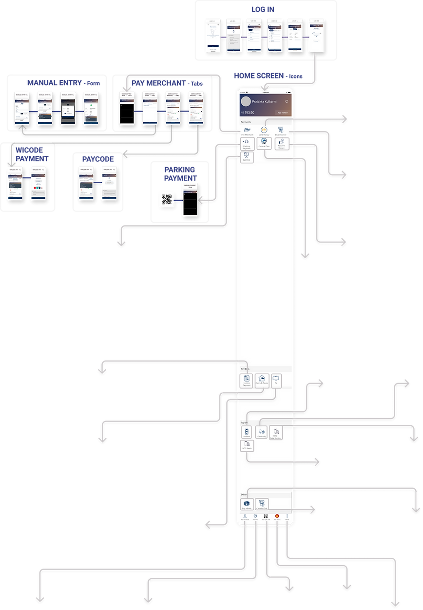
Site Map


What do we observe in the existing app?

Functional hierarchy on the home page
had me confused over what sort of payment I was about to make.

I felt flooded with several options on one screen. Further, the payment flow interface seemed as if I am typing into a government form.

Visual complexity through intricate icons can be avoided. Lacks visual lucidity.


An option of the funeral plan right on the first screen is a little unnecessary. This is anyways affiliated with another source.

While making quick payments aftermarket/ retail purchases, direct accessibility to commonly used features could be much handy.

To scan for several payments, it would be easier to have a prominent click, in a way to easily access it.

Payment navigation through tabs is inconvenient and confusing. It could be categorized through separate functions.


3 frequently used options on top
(Customized for each user)
Categorized payment options
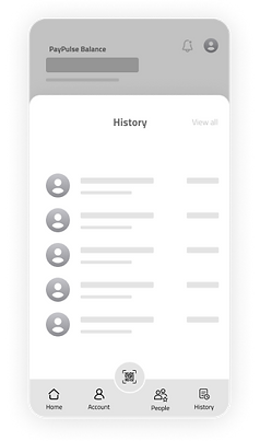

Home Screen
Bottom tab options for quick access
{History can be viewed to verify payments and recent people for close contact references)

Payment form

Payment Selection

Confirmation

Success

Electricity/ Mobile Top-up Payments

History Box

Rates & Taxes billers list

Pay merchant/ Contact


Thank you for your time & interest!
bottom of page